new features
At Experteer I was not only responsible for the mobile experience Experteer Beyond Jobs, but also worked on several smaller projects like adding new features to the website, redesign old page, update brand book and style guide, assist marketing campaigns by creating both print and digital materials and so on. They are maybe not as sexy as build a new fancy project from begining but they have big impact on improving current UX and bring business benefits. Here are three small projects I can already show.
Feb-Aug 2018 | Munich, Germany
Tools: Sketch, Zeplin, Frontify, Keynote
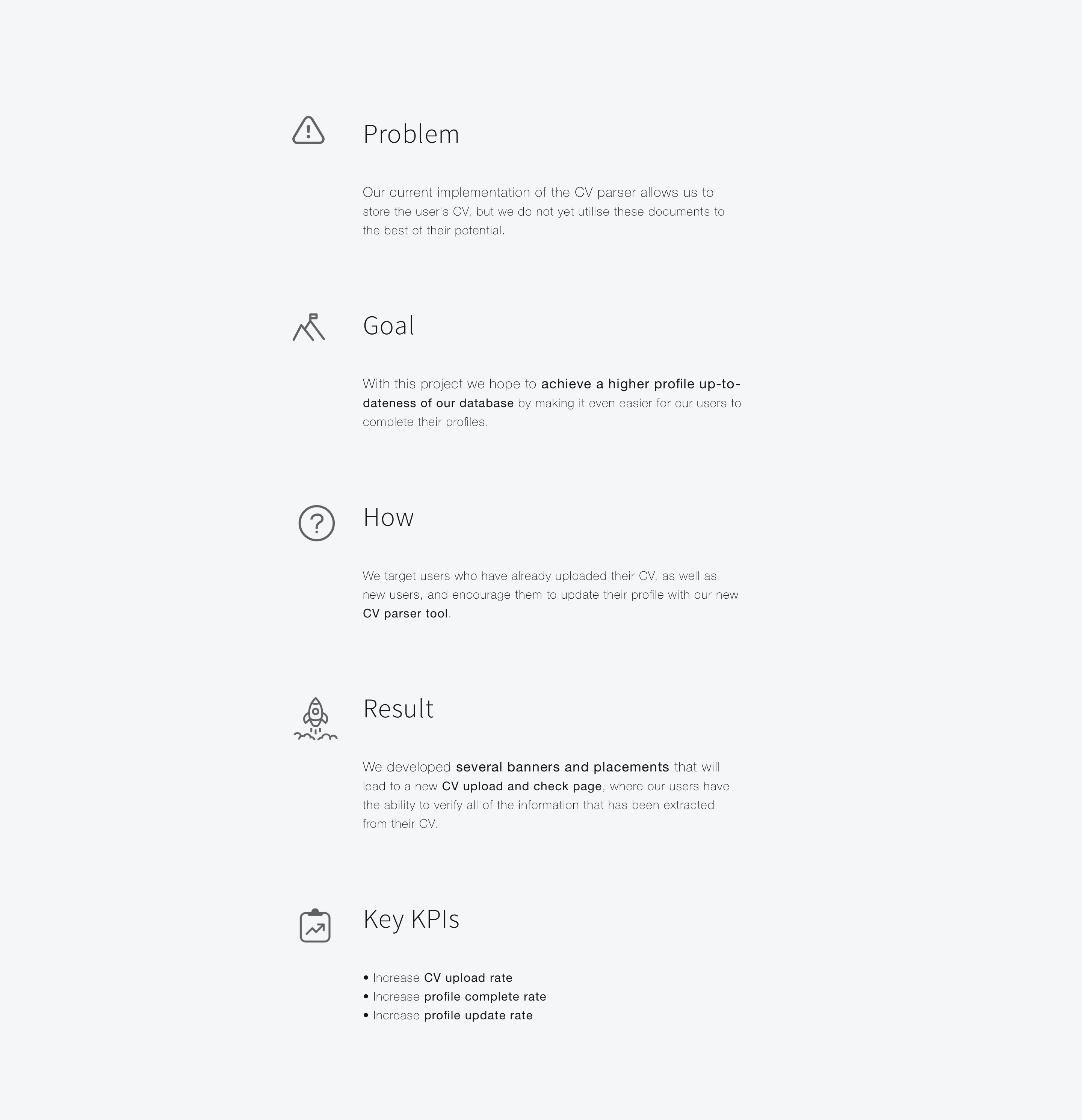
As a platform provides career service, the candidate profile is most valuable resource for us. Therefore the user experience of collecting information is super important. We want users fill in their profile as easy as possible and also a easy way to update out-dated profile.
ROLE
After recieved project briefing from product manager, I did research about the process how users upload there CV in different job search platform and analyse the pros and cons, discussed user case and logic with product manager. I conducted brainstorom session during the team and then I did several solution proposal and conducted design review meeting. After desicided on one of the concepts, I finished design for pixel perfect details and assisted implementation.

We start from analysed user group, check how they finish the task and define where we put the entrance to the new function.
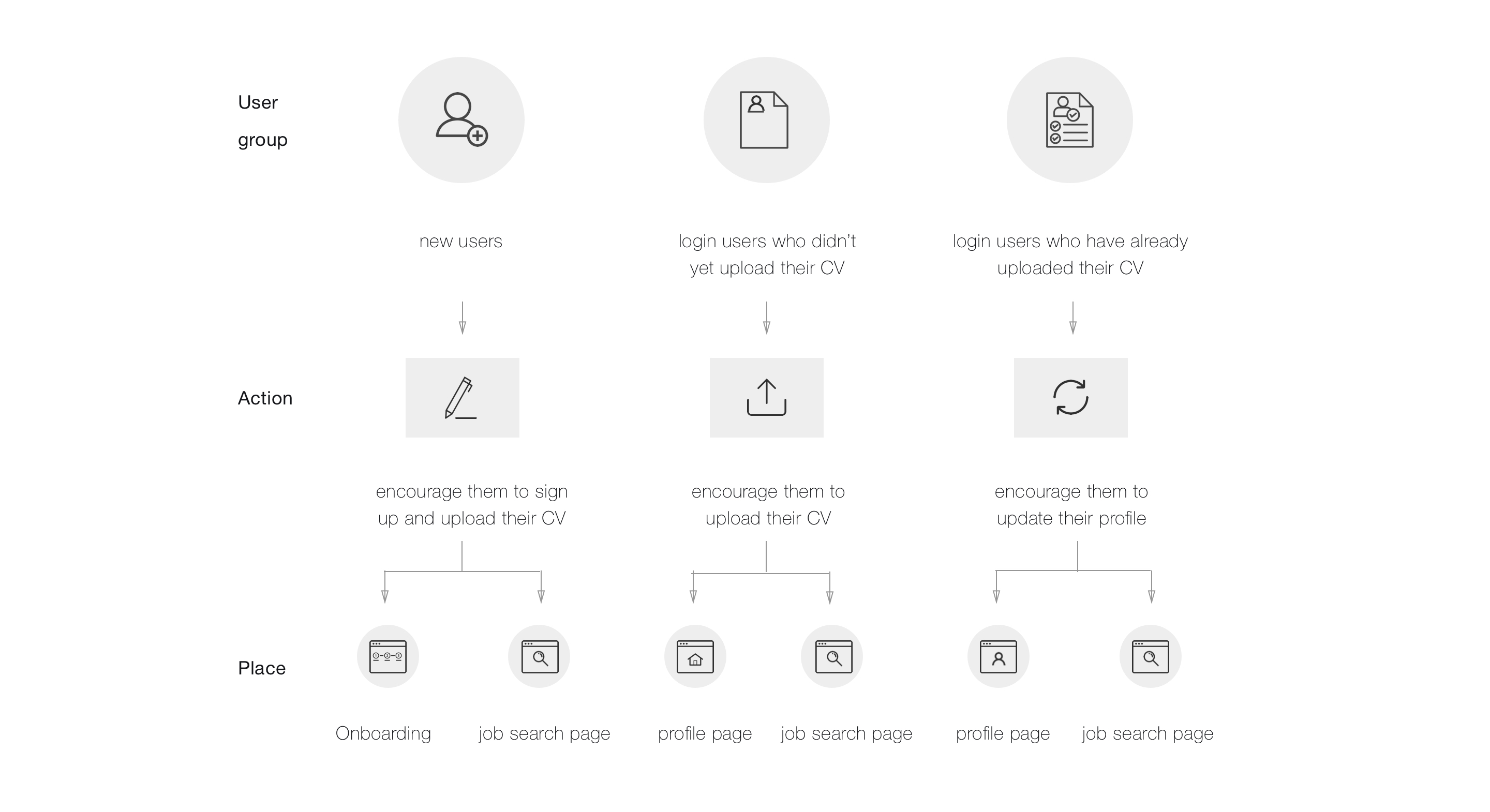
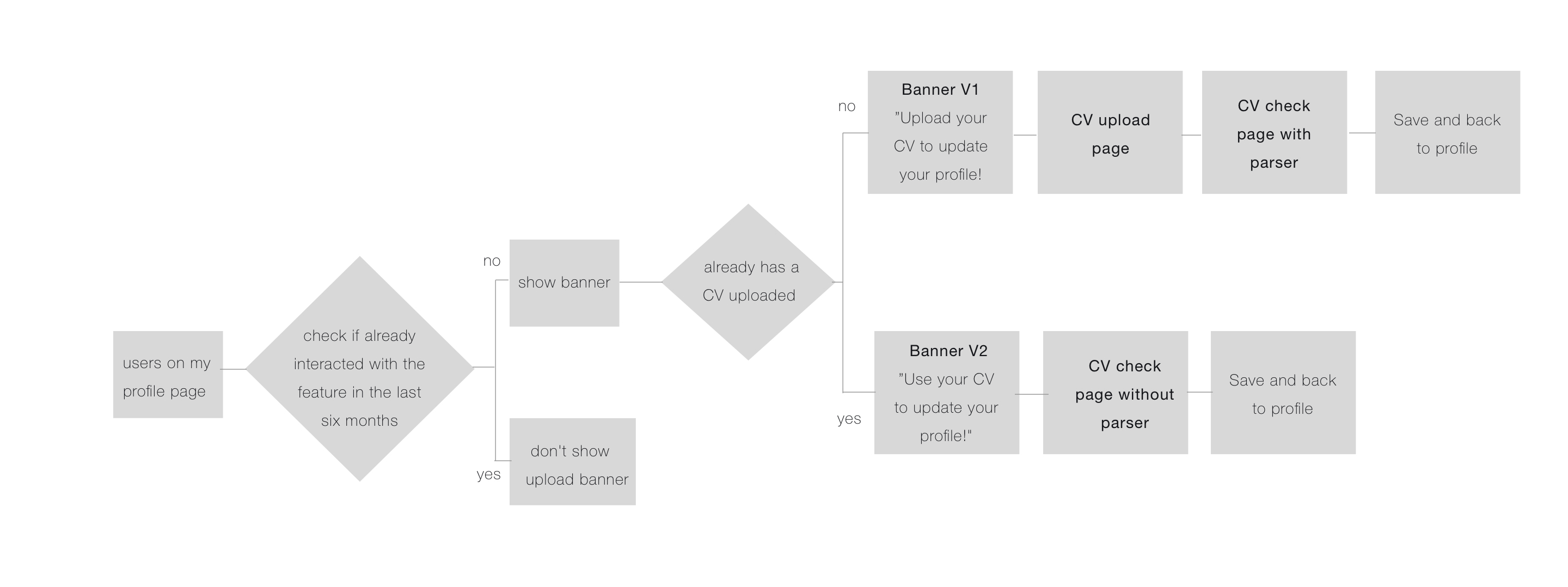
From analyse above we know we have six user cases, we are now defining user flow. This is the user flow when user start from profile page. When users see the profile, check whether the user has already interacted with the feature in the last six months via cookie, if not, we show different banner depends on different user group. The same logic used in other user case.
We put banner riht under main navi. In order to well fit the current page and catch users eyes, we created two color version on profile and job search page, for earch version we created two different wording for different user group in both German and English. The background tube enhance Experteer’s branding, orange button make the call to action stand out in the whole page for better conversion rate.
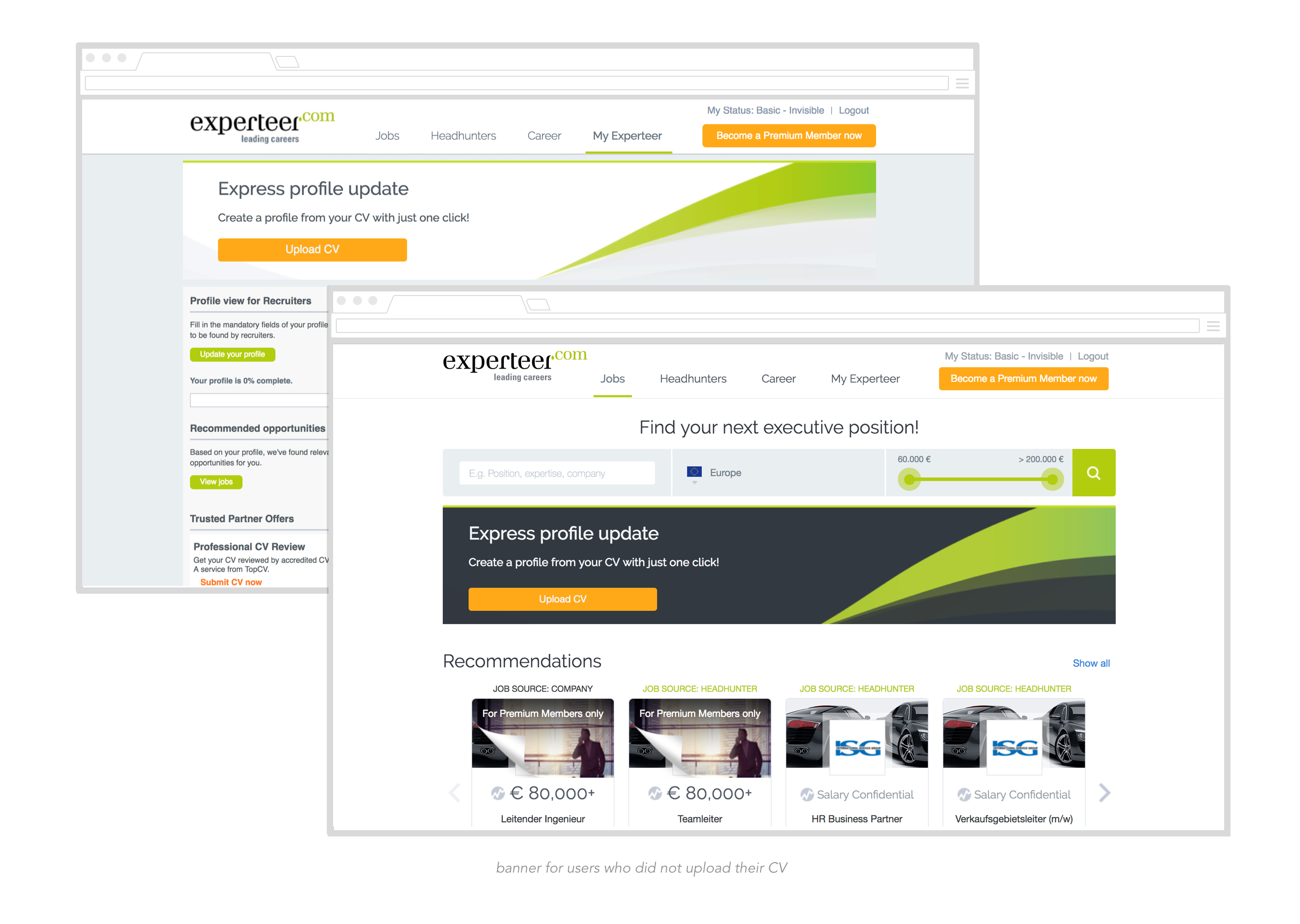

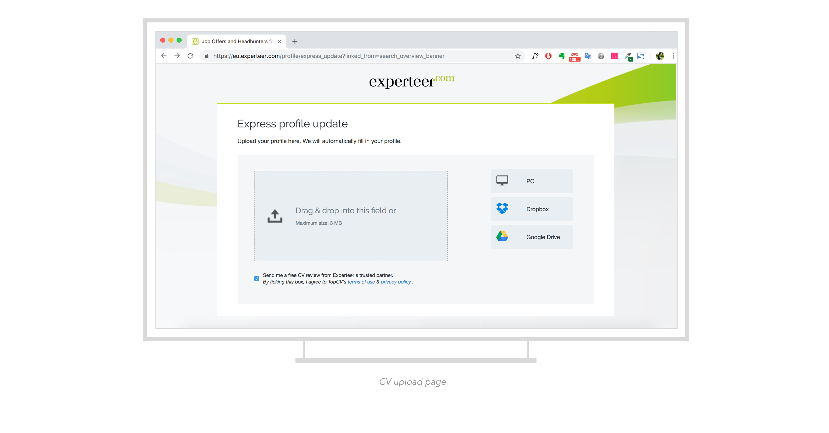
Solved the problem of where, now cames to how? Should we put it as overlay or a new item in navibar, or even a complete new page? So I did several proposals on how to realized CV upload function. Consider flexibility and tech resource, we finalliy decide to bulid a new page where user can upload their CV. The new page follows legacy style.

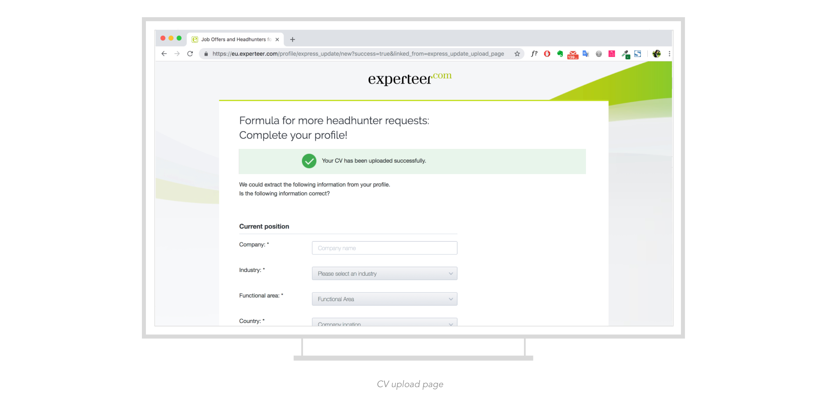
It’s always not a pleasant process fill in a long form. So after user successful upload their CV, we extract the information from their CV and fill in the form automatically. This is the CV check page, where our users have the ability to verify all of the information that has been extracted from their CV.

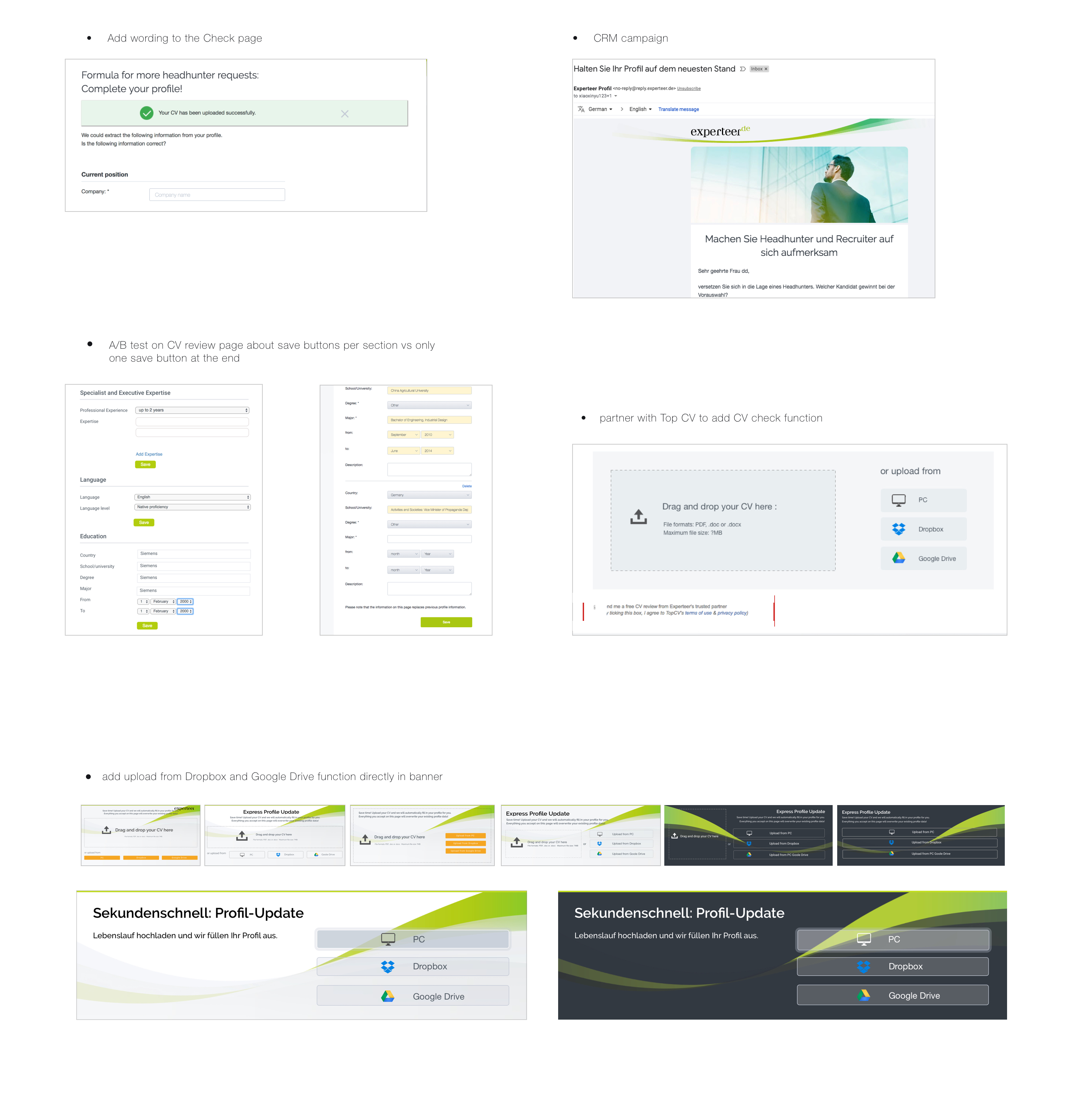
• profile rate increased by 13.7% from the previous month, 49.3% from last year.
• updates per user increased by 28% from the previous month.
• 48% CVs coming from new CV parser product.
• 70% of uploads successfully reviewed
• profiles completed rate increased 24.9% from the previous month, increased by 74.5% from last
year.
• bring siginificant amount of upsells and earnings..

Design & A/B Test
In order to making on-site communication more targeted, action based and eventually personalized. Increase number of candidates in the database, who have minimum profiles. This will engage B2C users more with the product, as they, after creating minimum profile, might be contacted by headhunter/recuiters and will receive weekly job recommendations (Drum beat).
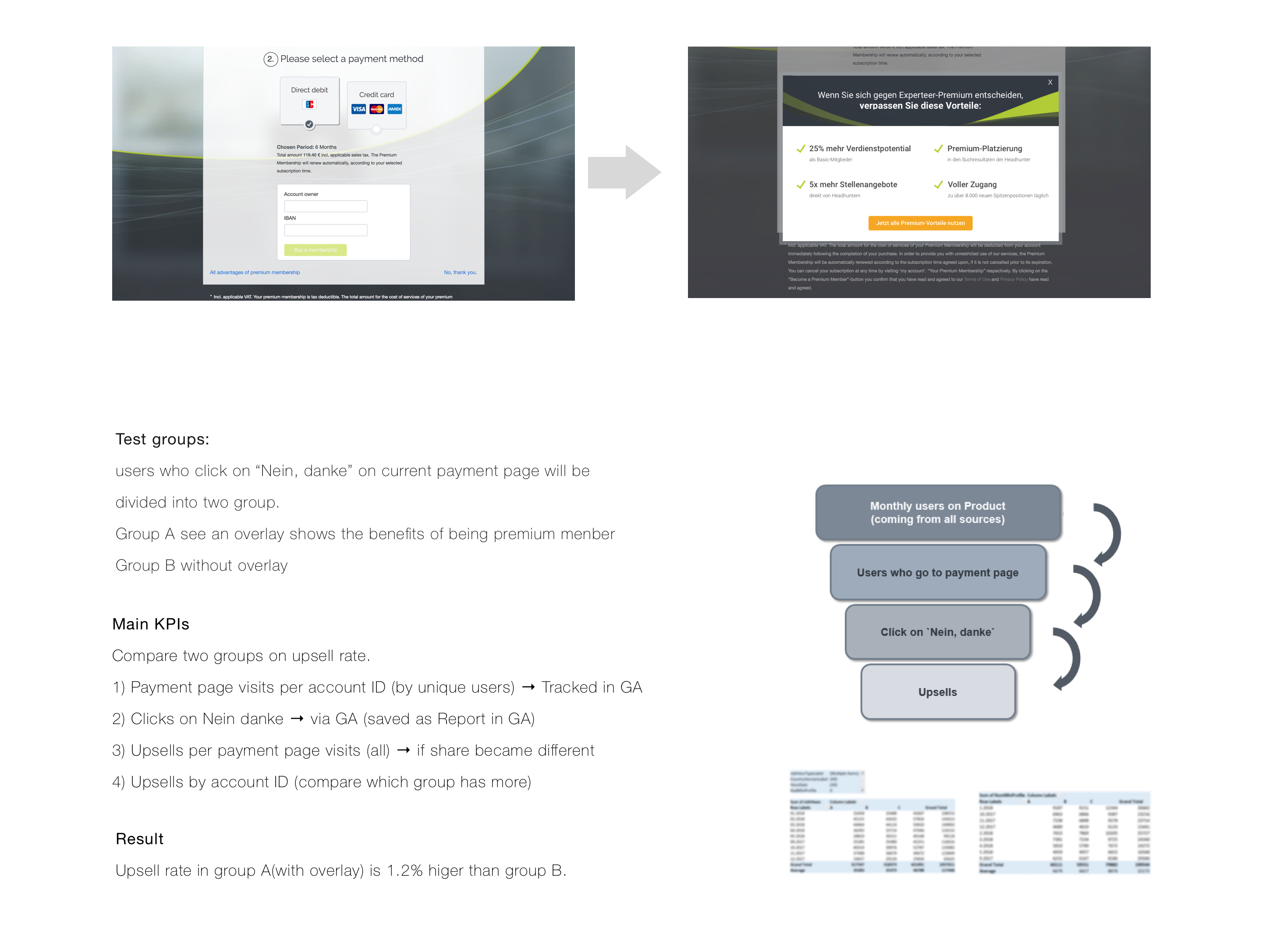
When user click on “no,thank you” on payment page, show a overlay strengthern the benefits of being a premium member. Track data and analyse if it improves upsell.
Design & A/B Test
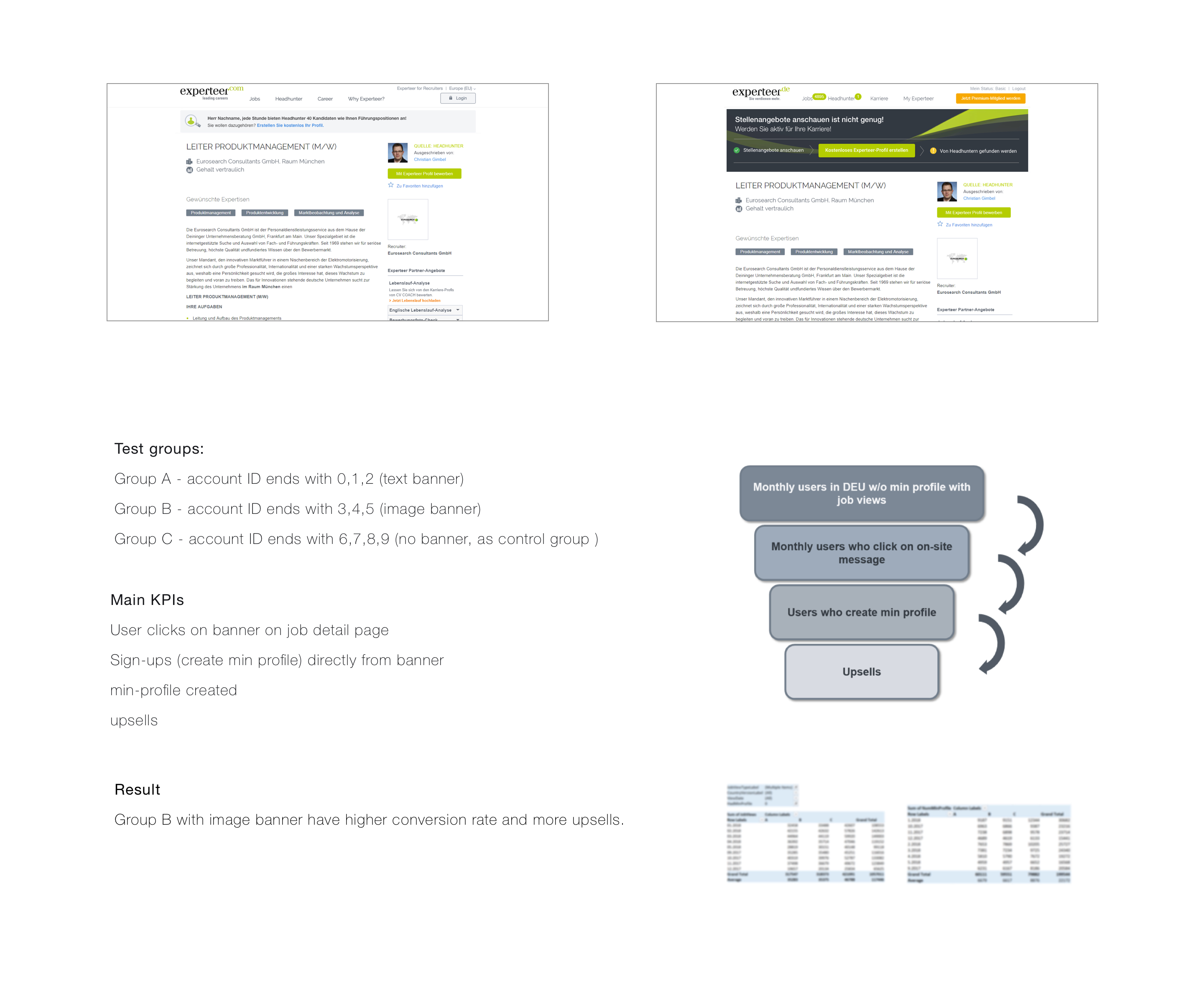
We target new users by creating banners lead to sign-up process on job detail page, where job description is fully visible. Because we always have a lot banners to be designed, as designer I want to know which kind of banner performs better to improve furter conversion rate on banners. So we test two kind of banners against each other to see which one performs better.
