Mobile UX&UI from conception to launch
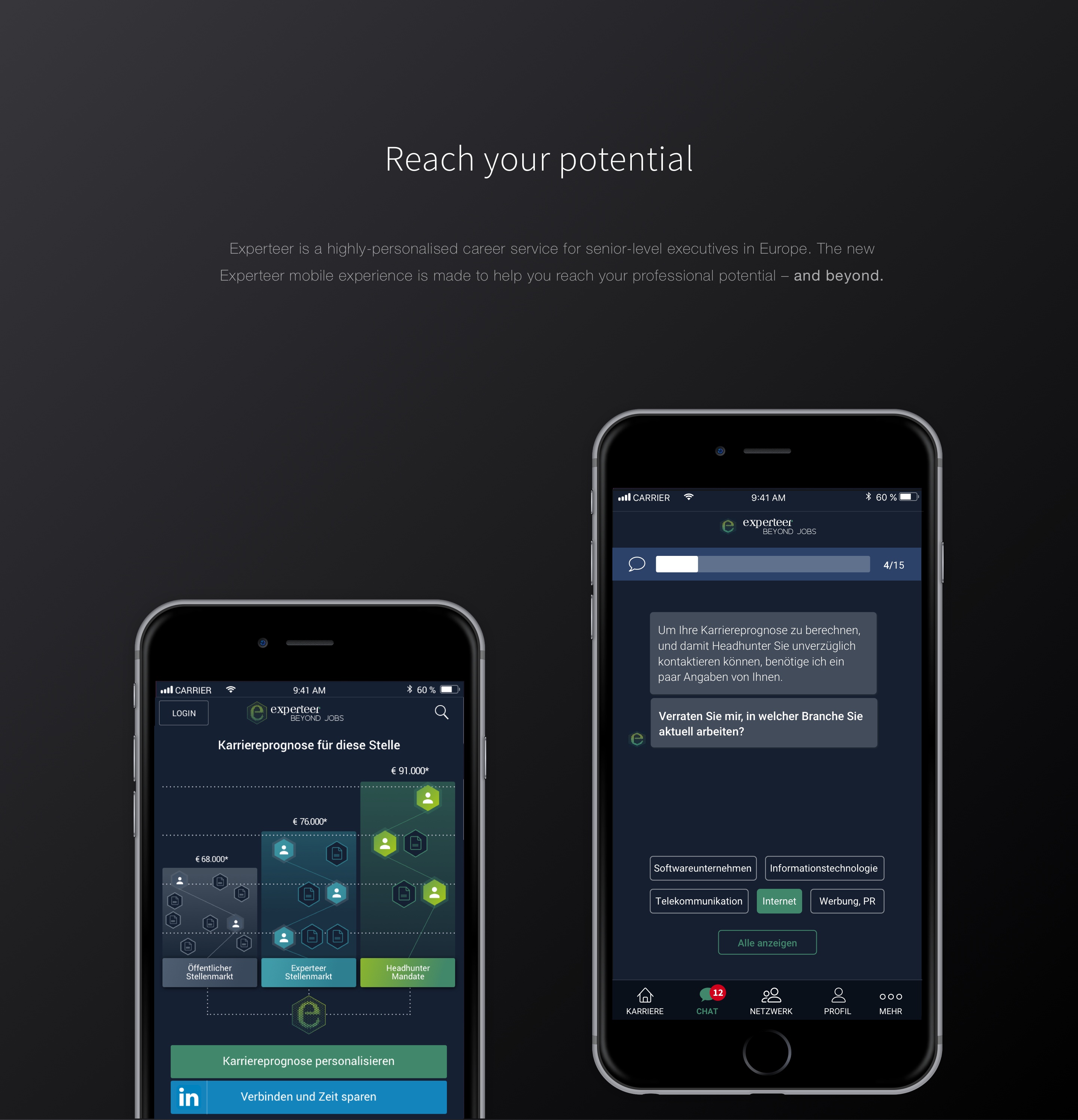
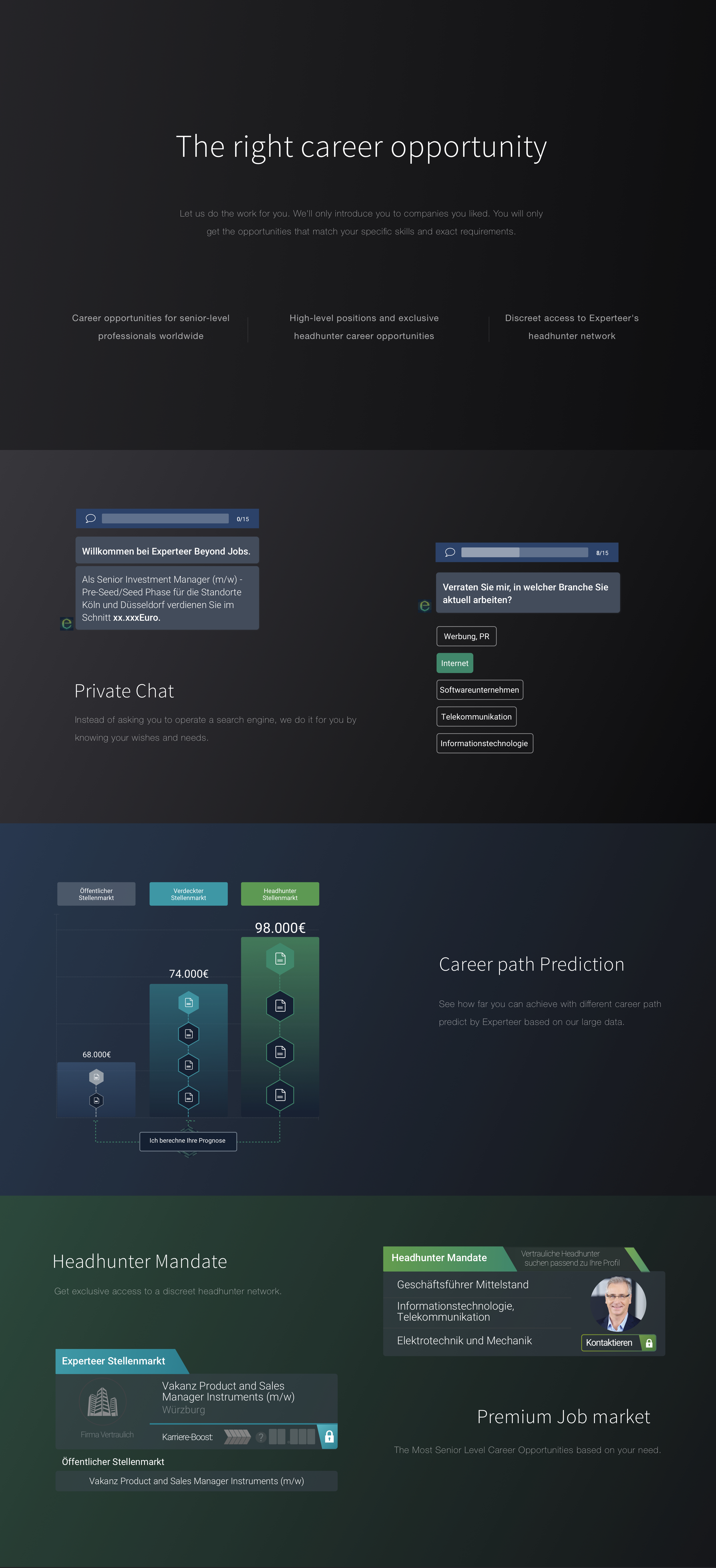
Experteer has a unique market position as the premium career and recruitment service in 10 European markets and the US, we only advertises executive positions and is entirely confidential for our candidates, if they want it to be. The new Experteer mobile experience steps away from a mere job board. Instead of asking you to operate a search engine, we do it for you by knowing your wishes and needs. It's different from competitors by providing tailored content that is valuable for your next career step.
Feb-Aug 2018 | Munich, Germany
Tools: Sketch, Principle, Zeplin, Frontify, Keynote
The old Experteer application is far from perfect when it comes to UX. I was the only UX designer in the team. I was challenged to design a fresh and appealing user experience from scratch so the new app could retain its target audience and attract new candidates. At the same time, I was challenged to communicate with Skateholders, product managers and developers by my own and fight for the best design solutions.
ROLE
As the only designer in the team, I was responsible for the user experience design from “0” to “1”. I defined key features with product manager and skateholder, lauched the product with develop team and continue iterate according to feedbacks. I conducted brainstorm sessions, created user flow, wireframe, communicated with skateholder and team members, conducted several design review meetings, worked on visual design, created brand language and maintained design styleguide. I also helped product manager to supervise and test the implementation to make sure the final product can meet the requirements and deadline, continue iterating.
First it took me sometime to understood the business model of Experteer and the vision of new mobile experience. Experteer has a unique market position as the premium career and recruitment service. The question began with how to highlight our strengths and different us from competitors. Having understood the business model, I focused on researching recruitment trends and recent innovations. To do so, I carefully examine the apps of the most popular vendors in the sphere – Linkedin, Monster, Glassdoor, Indeed, and others. This research gave me a couple of useful insights and valuable ideas.
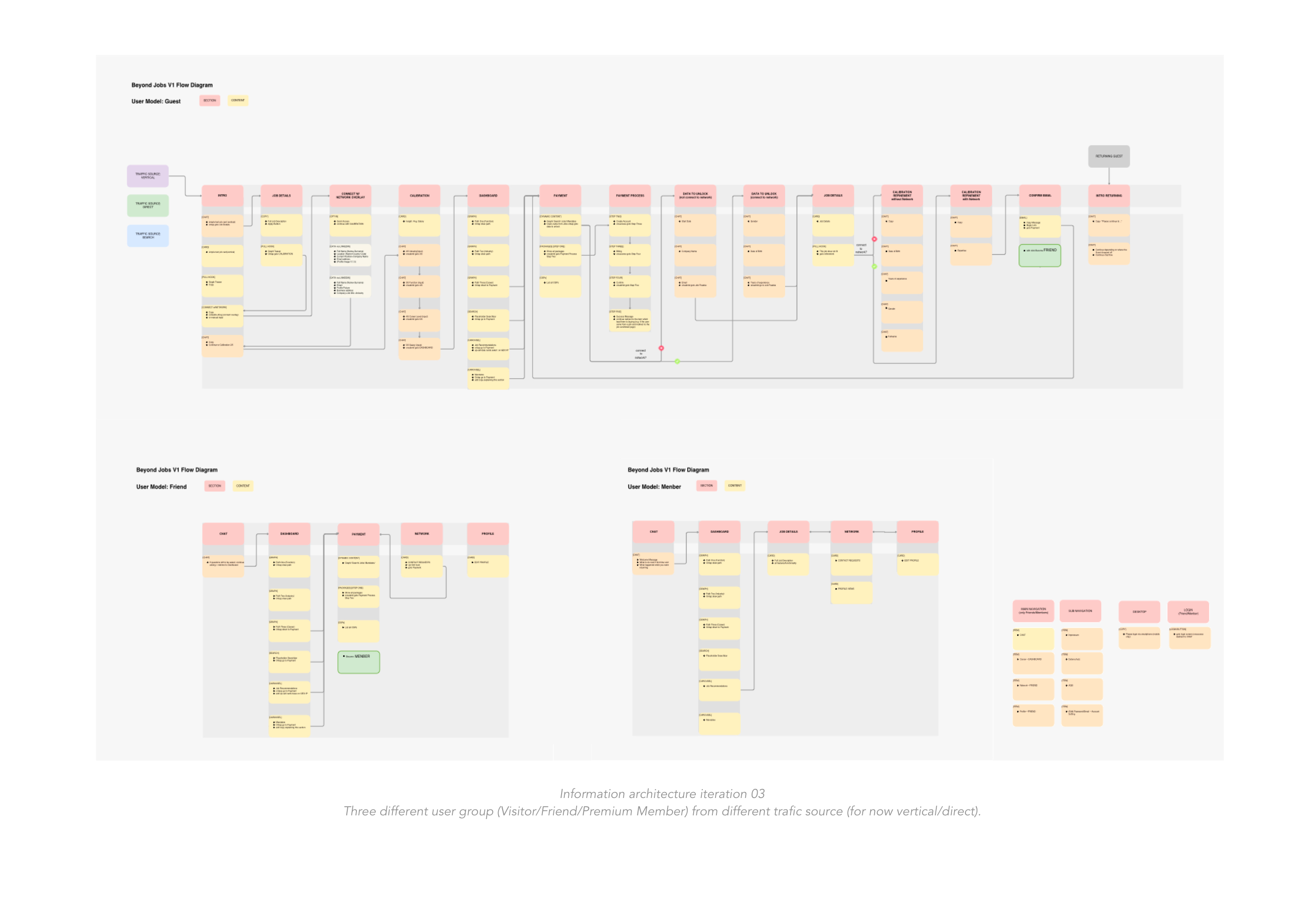
After research and rounds of discussion with skateholder, product managers, CRM team and developeps, we defined key features of our product and start the UX stage with creating the basic information architecture.

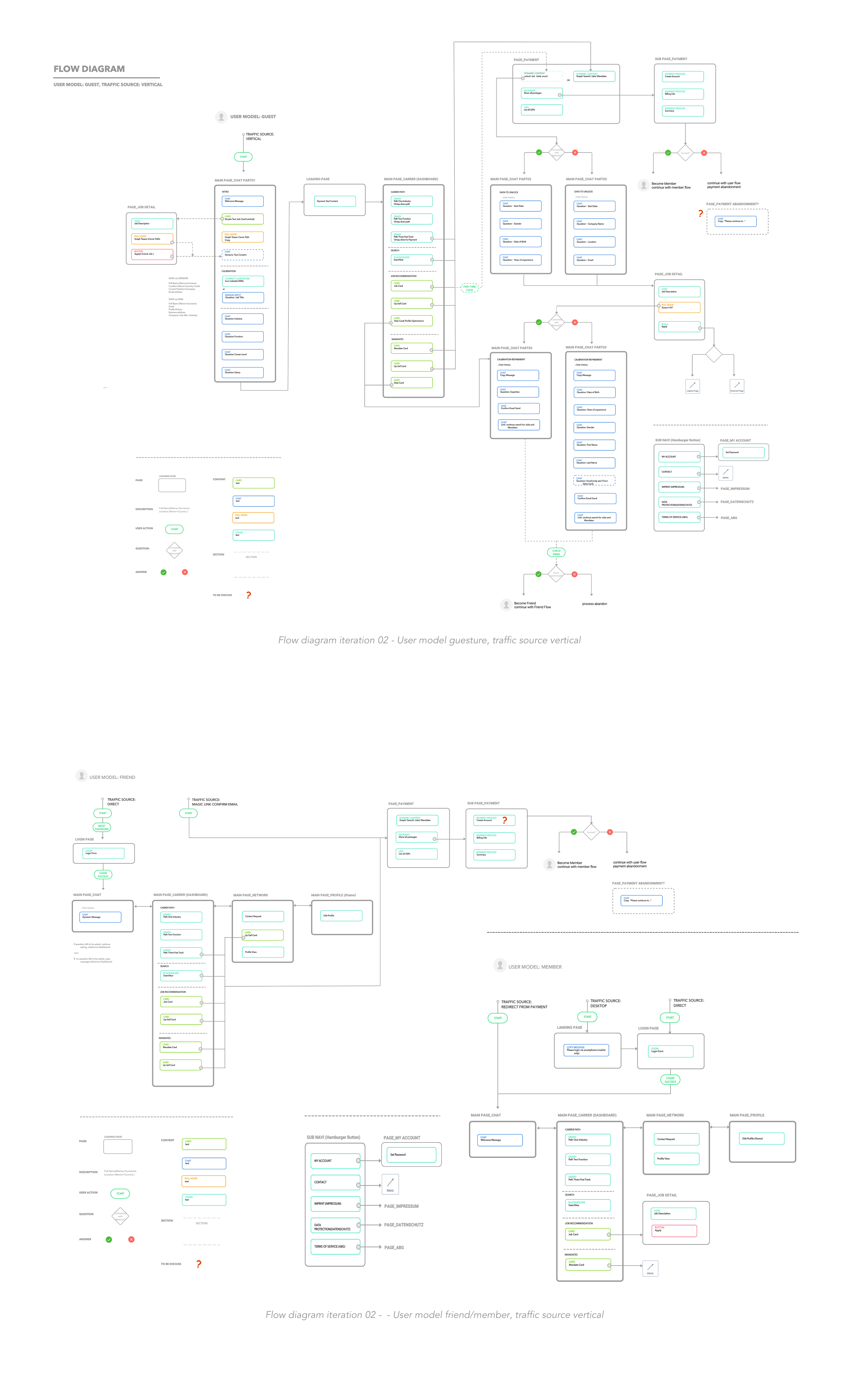
Next step was created flow diagram, which helps us to figure out how people interact with our product. Flow diagram define possible routes in the user journey through the product.
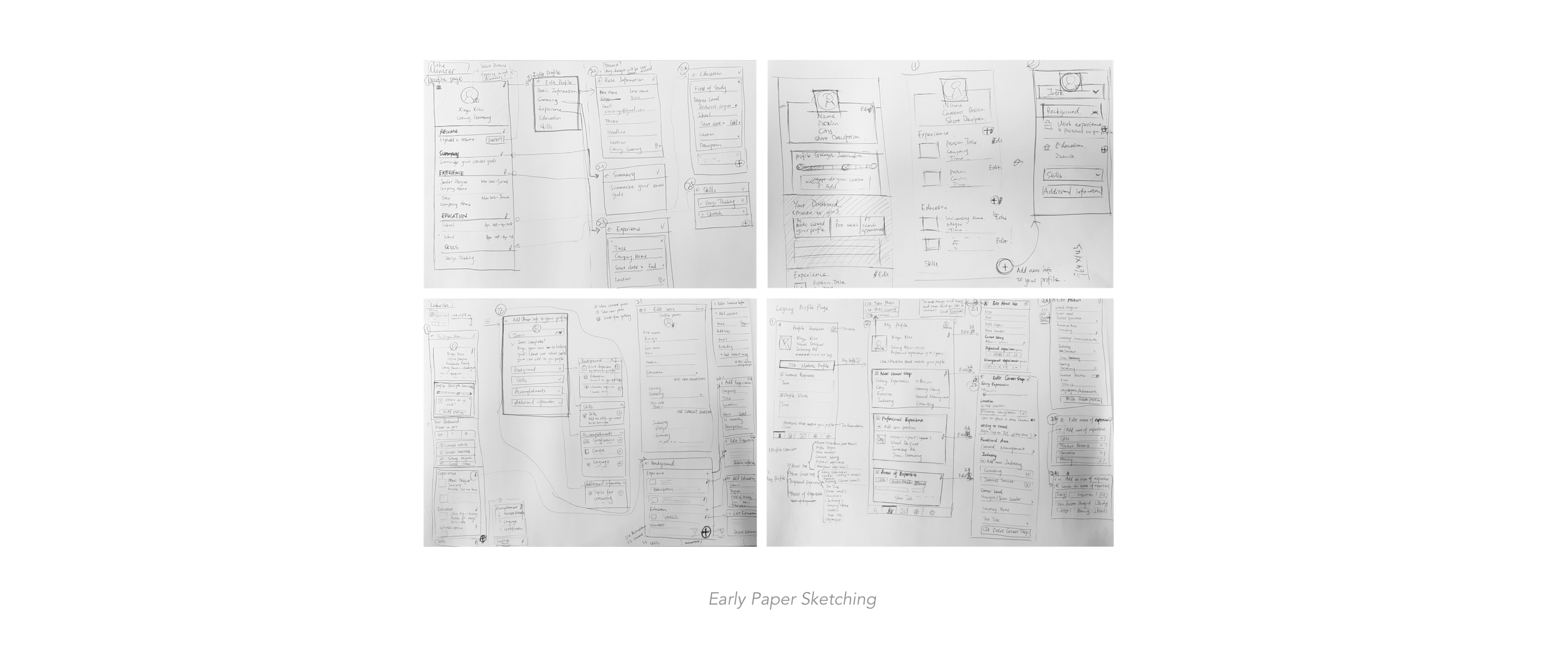
After flow diagram have been proved, I created wireframes (starting from drawing the first sketches on paper ended up with high-fidelity mockups).
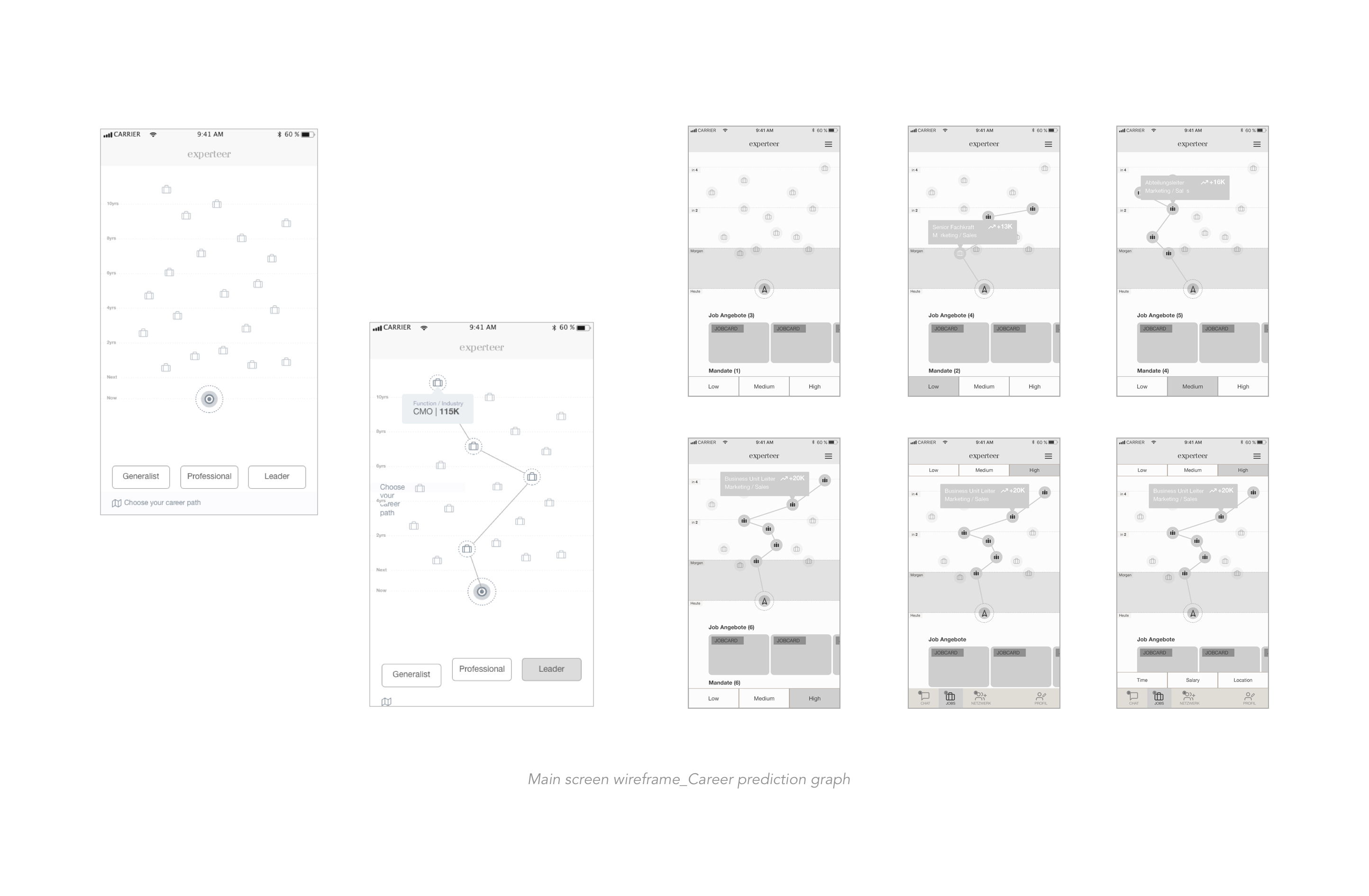
Career path prediction is an unique and important feature of the product. The graph is to visualize the user different options how to advance in his career.
• For basic users, the goal is to convert them into paying members
• per default the first node in the first graph is selected
• there are two places where the graph can be shown: Job detail page and Dashboard
• Basic users don‘t see the full graph, the upper part of the graph is hidden and links to the upsell page
• Premium users can interact with the whole graph
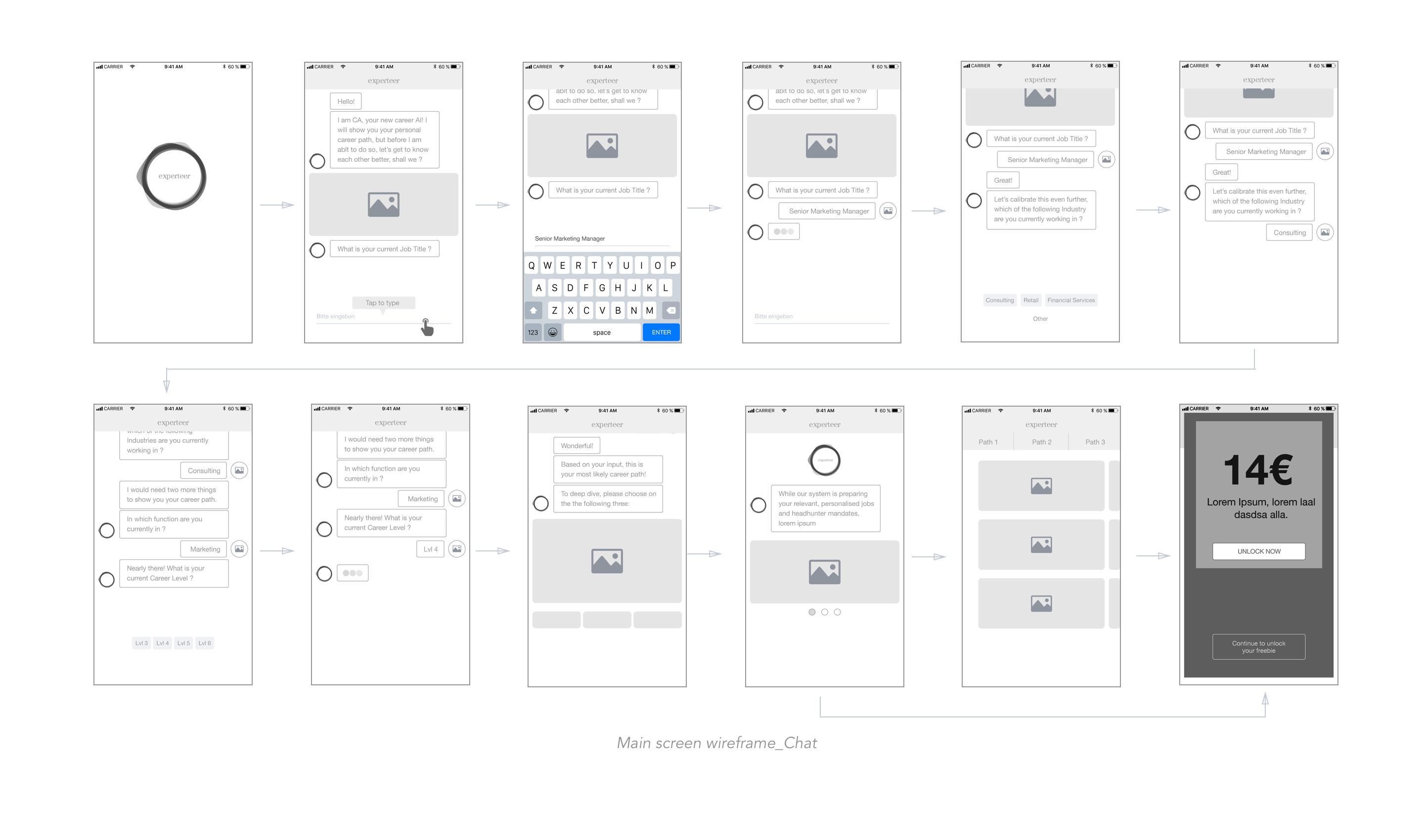
Chat to us! We asks users a few initial questions that take about 90 seconds to answer. With selection boxes, auto completor, it’s very easy to answer the question. Once complete, we will use AI to match you with the most suitable positions.
In this project I worked with a cross-functional team (VP/developers/data scientists/PMs) and took charge of milestone design presentations to the team. We received a lot of feedback mentioned the new version of the visual experience has improved significantly. After launched the firest version we use Google Analytics to track and analyse user behaviors, with new design we increase user engagement, improve sign up rate, profile rate as well as up sell rate constantly.